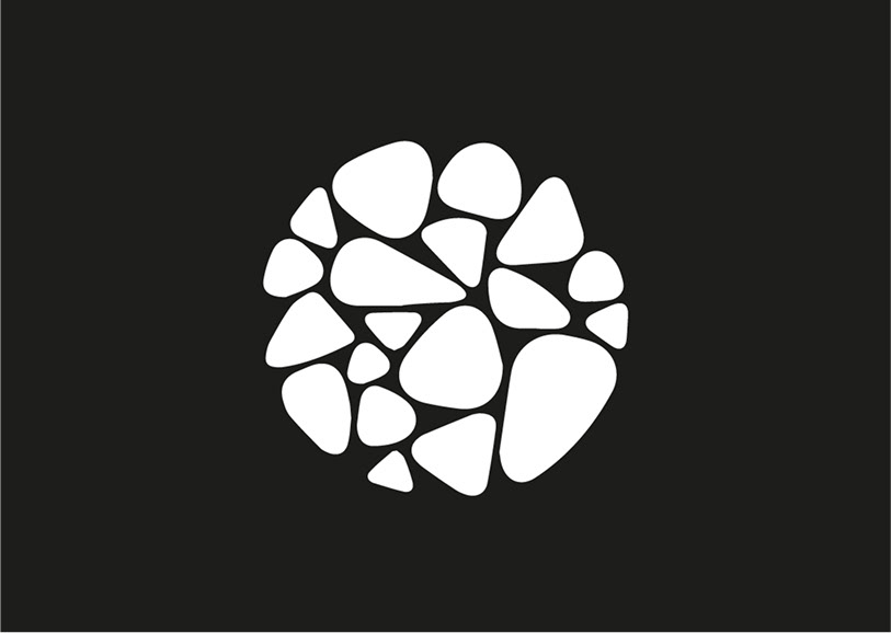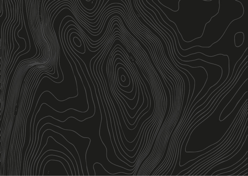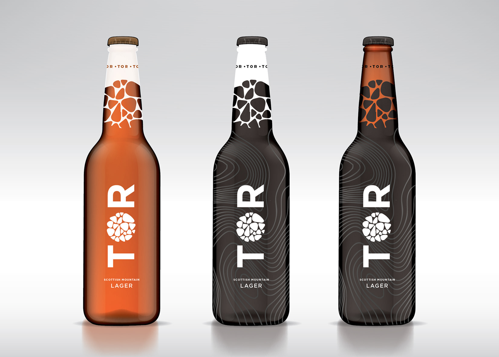
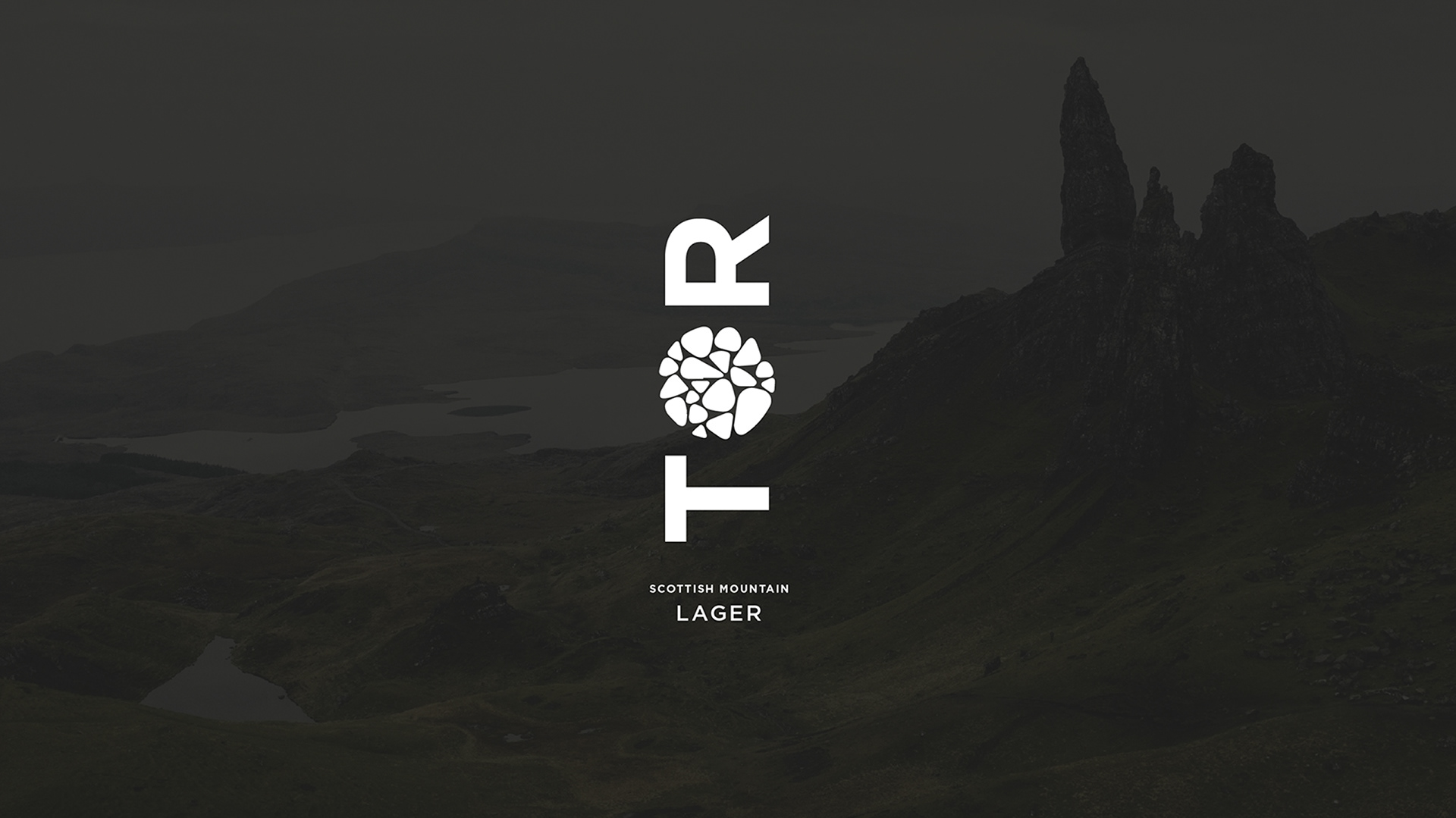
Carved by nature, crafted for impact
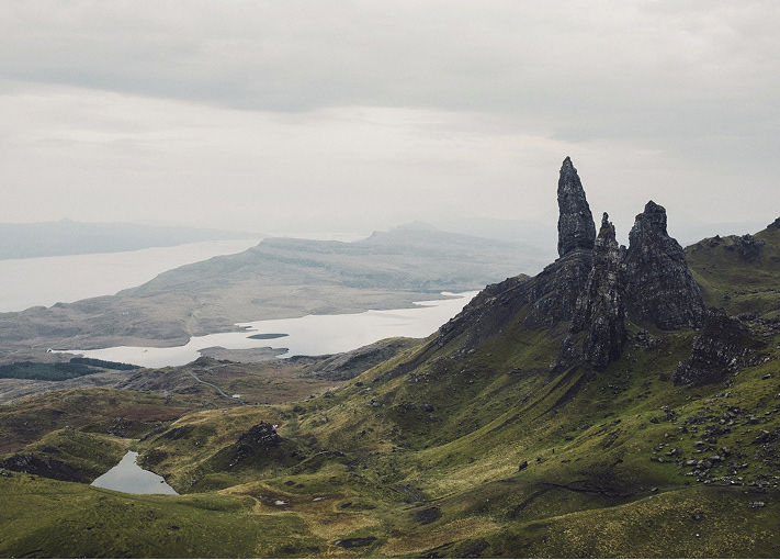
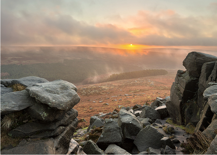
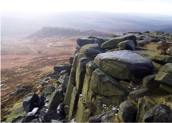
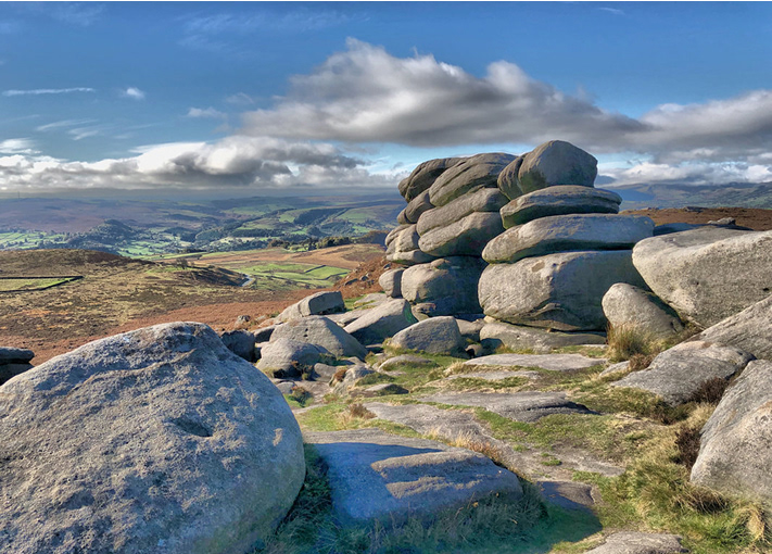
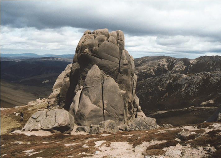
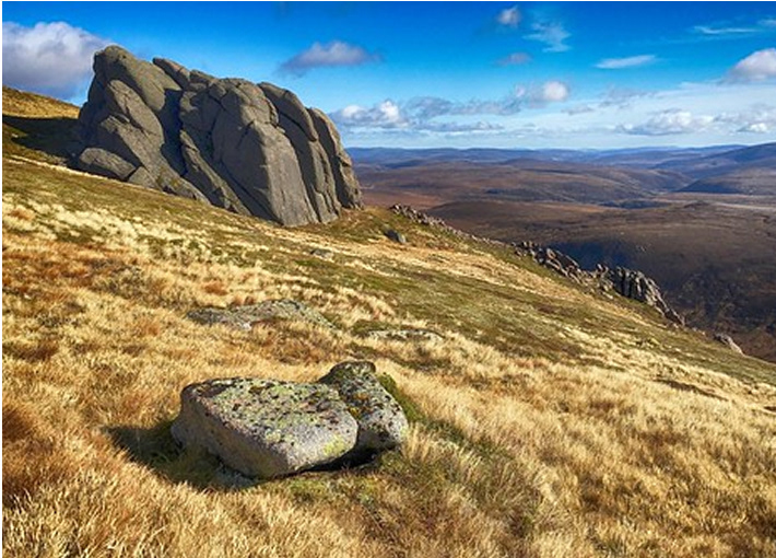
A minimalist brand identity inspired by the raw contours of the Cairngorms — created to cut through the noise of the craft beer market and connect with a new wave of drinkers.