
Design for Growth: Why Your First Logo Shouldn’t Be Your Last
How evolving your brand identity is key to reaching the next level
I often remind clients that the logo you start with isn’t the one you’re stuck with. Some of the world’s most successful brands began with logos that were clunky, overly detailed, uninspired, or just plain ineffective. What changed? They evolved. They updated their visual identity to align with their business ambitions and long-term growth.
Let’s look at four powerhouse brands: Apple, Starbucks, Nike, and Airbnb, to see how visual branding and strategic logo evolution helped them become global icons, build lasting emotional connections, and directly fuel their business growth.

1. Apple: Streamlining for strategic impact
Then (1976): Apple’s very first logo featured Isaac Newton sitting under an apple tree, surrounded by an ornate frame and a scroll reading, ‘Apple Computer Co.’ It was more Victorian illustration than tech innovation, detailed, hard to reproduce, and far from modern.
Now: Today’s Apple logo is sleek, minimal, and instantly recognisable in any context, whether on a billboard or the back of a MacBook. The monochromatic bitten apple is a masterclass in simplicity — clean, scalable, and emotionally aligned with the brand’s ethos. No words, no fluff, just a bold, visual statement of innovation and elegance.
Why evolution worked
As Apple grew into a design-driven tech giant, the logo evolved to become functional and deeply symbolic of the brand’s values: simplicity, accessibility, and forward-thinking design. The new identity didn’t just look better, it aligned with the brand’s promise and elevated perception. Apple evolved its branding to reflect a shift from niche hobbyist products to mainstream consumer tech. Its logo now signals quality and aspiration across cultures and industries.
As Apple grew into a design-driven tech giant, the logo evolved to become functional and deeply symbolic of the brand’s values: simplicity, accessibility, and forward-thinking design. The new identity didn’t just look better, it aligned with the brand’s promise and elevated perception. Apple evolved its branding to reflect a shift from niche hobbyist products to mainstream consumer tech. Its logo now signals quality and aspiration across cultures and industries.
2. Starbucks: Evolving into a cultural icon
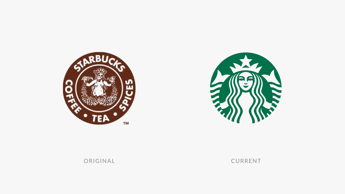
Then (1971): Named after Starbuck, the first mate in Moby-Dick, the original Starbucks logo featured an illustrated, bare-breasted two-tailed siren, surrounded by the words ‘Starbucks Coffee, Tea, and Spices.’ The design was brown, busy, and more maritime myth than modern café. It didn’t quite meet the demands of a modern, scalable brand.
Now: Starbucks’ current logo is streamlined. The siren remains, but she’s been simplified and cropped into a clean, green-and-white circle with no text. The choice of green, often associated with growth, calm, and connection, reinforces the brand’s emotional tone. The new mark is more polished, scalable, and emotionally resonant. It captures the brand’s evolution into a globally recognisable lifestyle and cultural symbol, not just a coffee chain.
Why evolution worked
Starbucks expanded far beyond coffee beans into lifestyle, culture, and community. By refining the brand visuals, Starbucks positioned itself as a lifestyle brand with global appeal — not just a local coffee shop. A cleaner logo helped it become instantly identifiable in any country, becoming a cultural symbol synonymous with community, comfort, and cross-cultural resonance.
Starbucks expanded far beyond coffee beans into lifestyle, culture, and community. By refining the brand visuals, Starbucks positioned itself as a lifestyle brand with global appeal — not just a local coffee shop. A cleaner logo helped it become instantly identifiable in any country, becoming a cultural symbol synonymous with community, comfort, and cross-cultural resonance.
3. Nike: Refining a symbol of performance
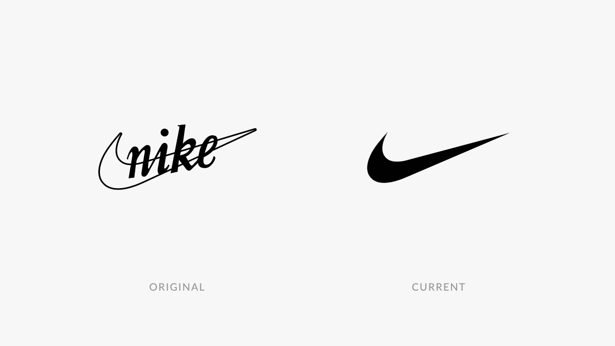
Then (1971): The original Nike Swoosh was created by a graphic design student for just $35. It was paired with clunky, uninspiring typography that didn’t match its sleekness or energy. It lacked polish, but the potential was there.
Now: Nike has dropped the name entirely from most uses. The Swoosh stands alone — a dynamic, unmistakable symbol of movement, ambition, and performance, universally associated with athletic excellence and empowerment.
Why evolution worked
Nike’s rebrand wasn’t about changing the symbol, but about refining and elevating it into a stamp of excellence that every athlete aspires to wear. Nike refined rather than replaced. The removal of text allowed the brand to become a truly universal icon, with global influence and strong emotional resonance. The evolution made the brand feel bigger and more confident, building a global community that shares its values. It aligns perfectly with Nike’s ‘Just Do It’ call to action, inspiring us to push beyond our limits and be the best we can be.
Nike’s rebrand wasn’t about changing the symbol, but about refining and elevating it into a stamp of excellence that every athlete aspires to wear. Nike refined rather than replaced. The removal of text allowed the brand to become a truly universal icon, with global influence and strong emotional resonance. The evolution made the brand feel bigger and more confident, building a global community that shares its values. It aligns perfectly with Nike’s ‘Just Do It’ call to action, inspiring us to push beyond our limits and be the best we can be.
4. Airbnb: Elevating identity to inspire confidence
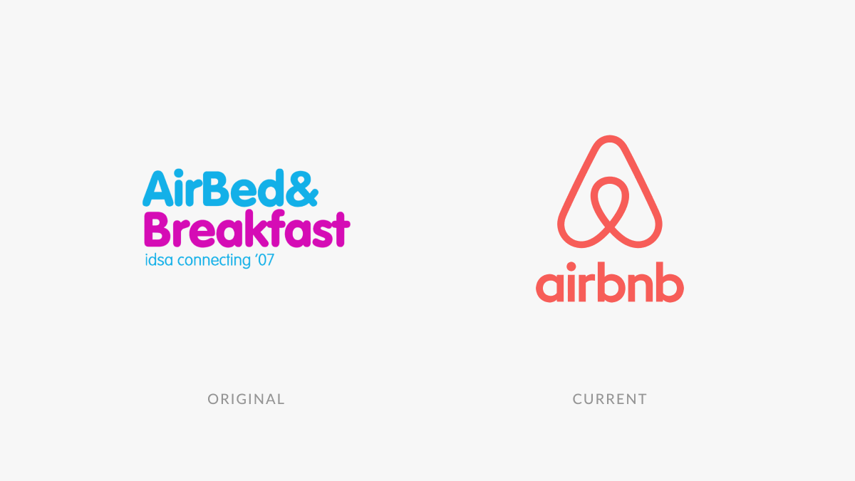
Then (2008): Airbnb’s early branding was plain and forgettable, with no visual personality, emotional warmth, or unique identity. Using basic and uninspired fonts, it lacked character or any hint of trustworthiness.
Now: The introduction of the ‘Bélo’ symbol — a modern, distinctive, and easily reproducible mark that unified Airbnb’s core beliefs into a single, emotionally inclusive identity centred on “belonging” — marked a major shift. Combined with a softer wordmark and modern colour palette, the brand suddenly felt trustworthy, human, and visionary.
Why evolution worked
The rebrand wasn’t just aesthetic. It made Airbnb feel more approachable and inclusive, embracing a more playful, creative personality. It also gave the company a clear purpose and visual voice, helping it evolve from scrappy startup to a global brand built on emotional connection and trust. That clarity unlocked its next phase of growth — and investor confidence.
The rebrand wasn’t just aesthetic. It made Airbnb feel more approachable and inclusive, embracing a more playful, creative personality. It also gave the company a clear purpose and visual voice, helping it evolve from scrappy startup to a global brand built on emotional connection and trust. That clarity unlocked its next phase of growth — and investor confidence.
Brand evolution can unlock your next stage of growth
Every brand on this list started with a logo that didn’t match its future potential — and that’s perfectly normal.
What matters is recognising when your brand identity no longer reflects where your business is headed. What worked when you were a startup may hold you back as you scale. A successful brand evolution isn’t just cosmetic. When done right, it’s a strategic move that can reshape perception, build trust, and unlock new opportunities for growth.
As a visual brand designer, my role isn’t just to make things look good. It’s to help you craft a brand that aligns with your purpose, resonates with your audience, and scales with your ambition.
So if your current branding no longer reflects who you are or where you’re going, take it from Apple, Starbucks, Nike, and Airbnb: evolving with intention can transform your brand into one of your most powerful business assets.
Ready to evolve your brand to match your business ambitions? Let’s talk
about how design can move your business forward.