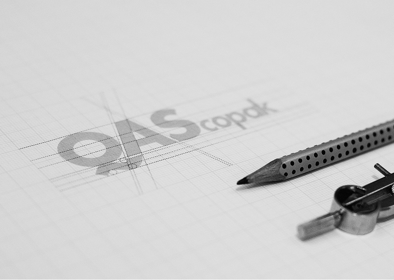
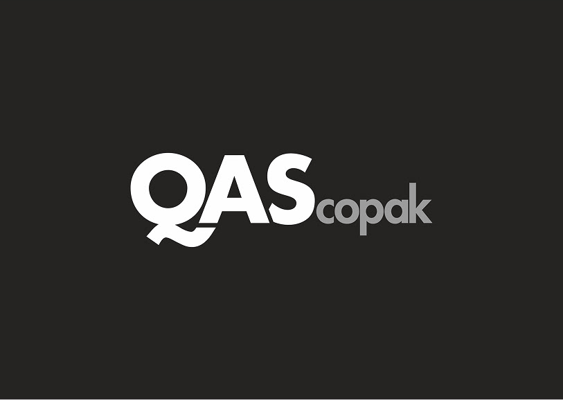
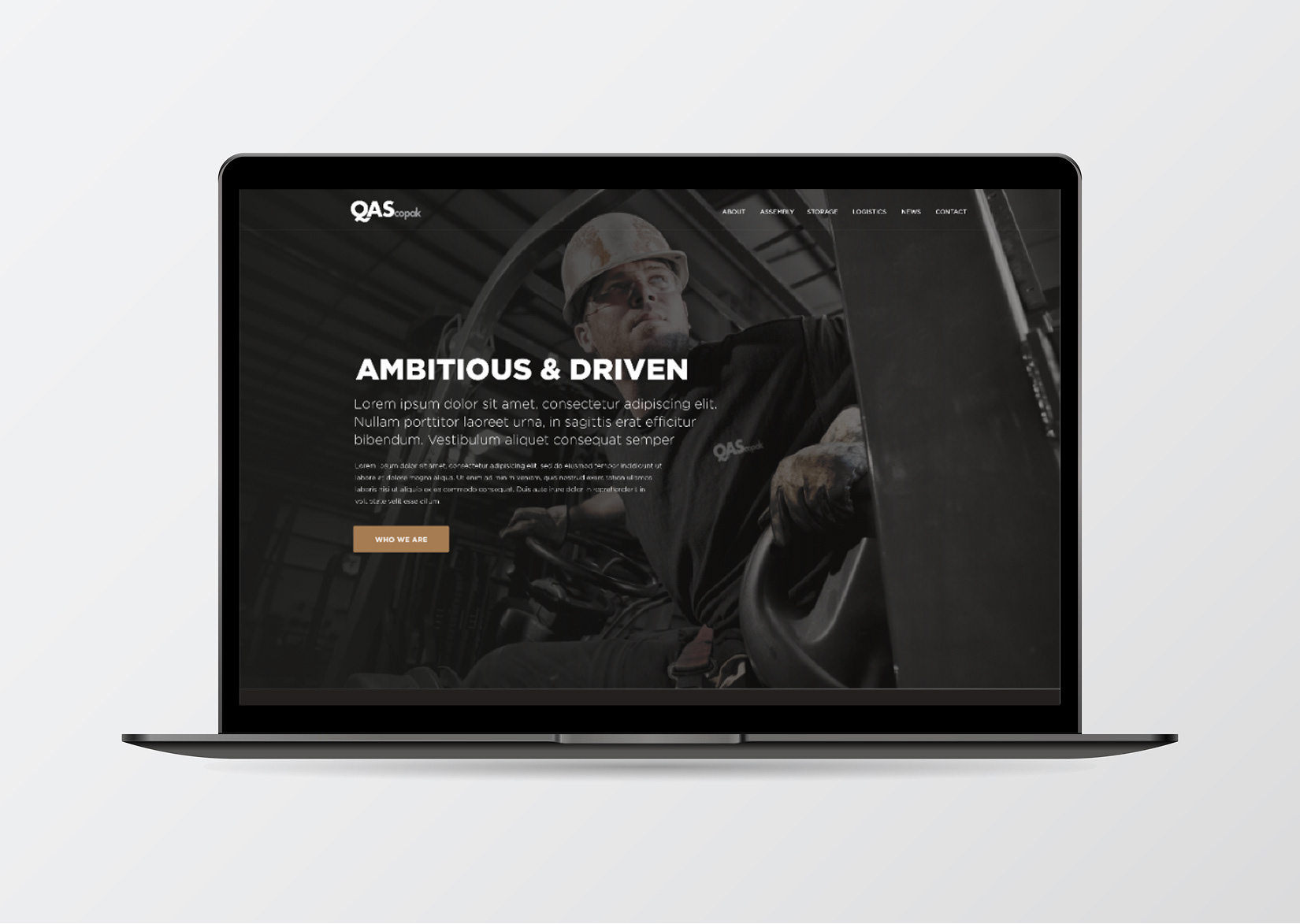
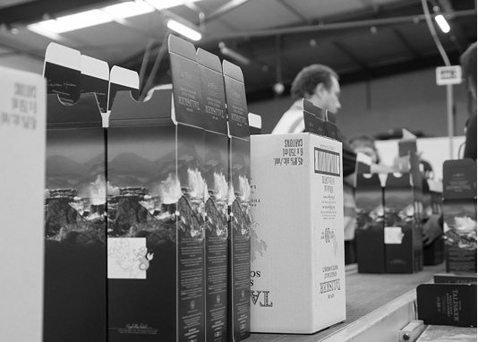
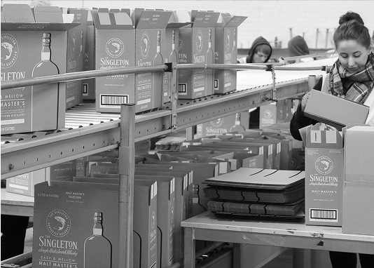
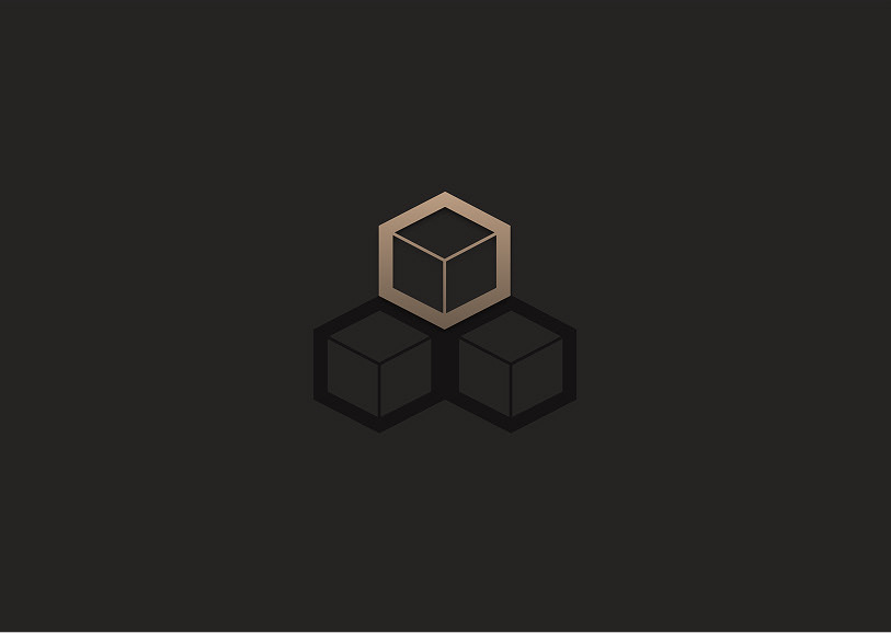
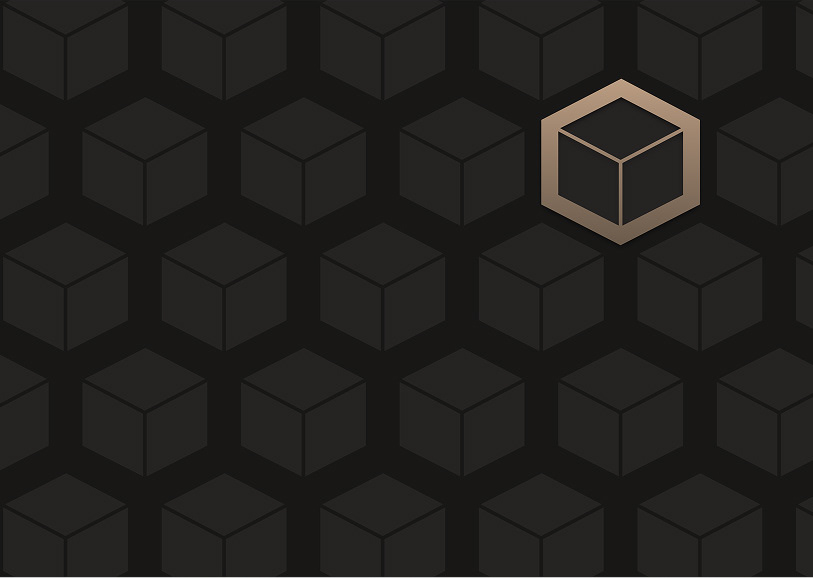
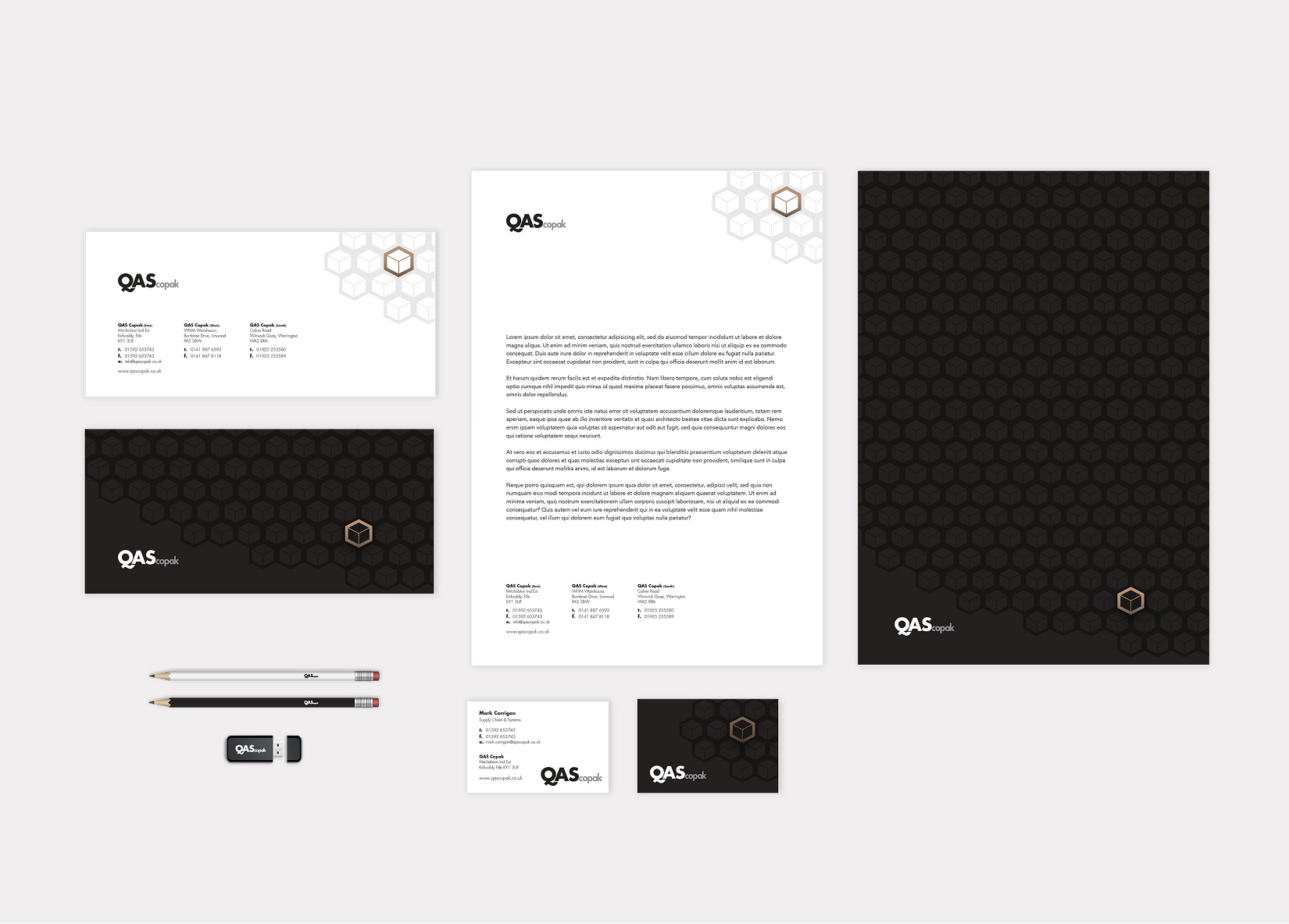
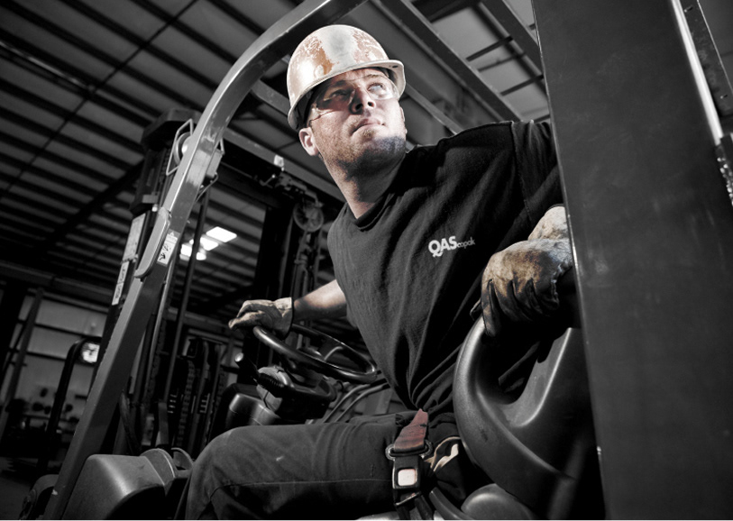
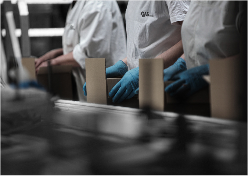
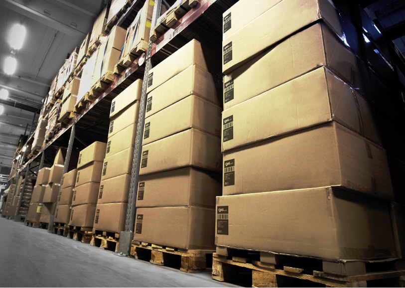
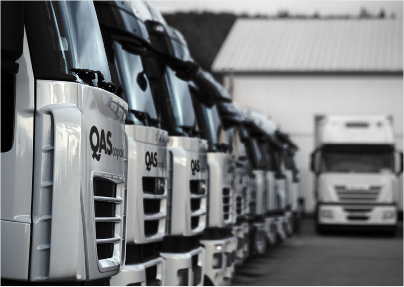
QAS delivers expert assembly, storage, and logistics services, combining large-scale capability with a sharp focus on individual client needs.


Created as a visual branding concept in 2013, the new identity centres around a bold, customised logotype where the tail of the ‘Q’ seamlessly connects to the ‘A’, reflecting the integration and flow that defines the QAS service model. Set in white on black, with “copak” in silver, the mark is both striking and minimal, a confident expression of precision and reliability.
A key supporting element is the QAS package motif: a stacked cube system representing the company’s core services — assembly, storage and logistics. Among a field of darkened cubes, one is always highlighted in copper, symbolising the client’s product. It’s a clear visual cue that, within the scale of QAS operations, individual focus remains paramount.
Typography is set in Futura for its geometric clarity and modern utility. Combined with a sharp monochrome palette and minimal use of metallic accent colours, the identity system is clean, confident and built for clarity across every brand touchpoint.


