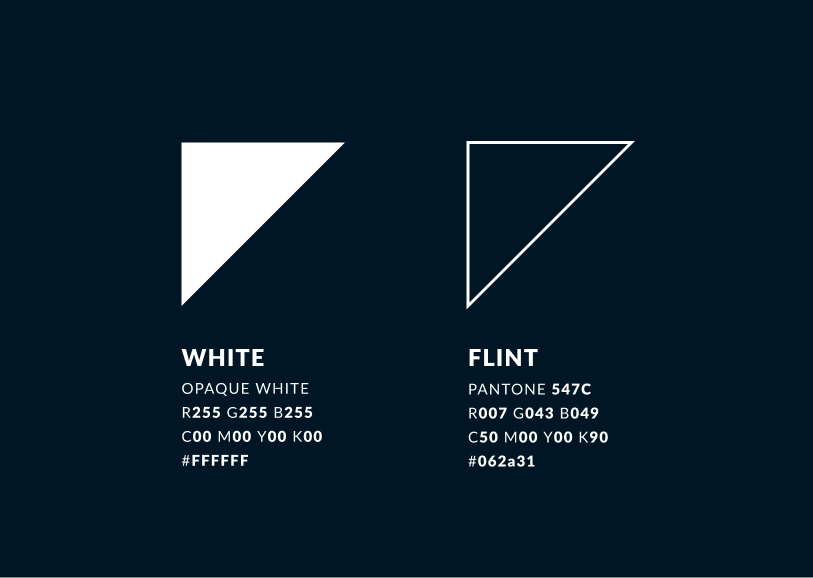
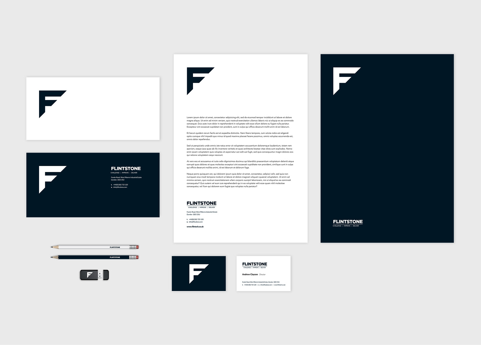
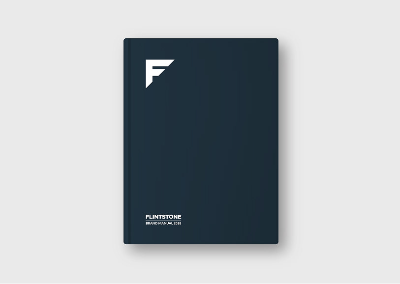
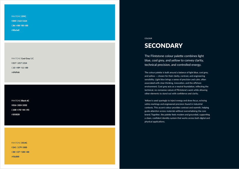
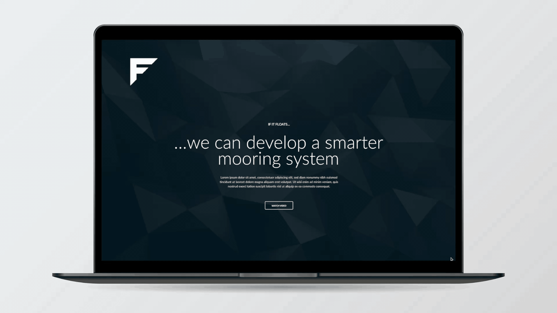
Flintstone creates advanced mooring systems for the global energy sector, combining hands-on innovation with solid, reliable engineering to solve tough offshore challenges.
Flintstone Technology provides advanced mooring systems for the global energy sector. Known for its practical innovation and robust engineering, the company needed a visual identity that reflected its confident, solution-driven mindset. The brand had to feel strong, clear and capable, built to perform in real-world conditions, not just look good on paper.

At the heart of the identity is a custom-designed, stylised ‘F’. Constructed from thick, bold strokes and cut at a sharp 45-degree angle, the form is simple yet assertive. The angular cut adds visual energy and leads the eye forward, reinforcing the company’s progressive, no-nonsense approach. This mark acts as a recognisable and adaptable symbol, one that communicates strength and direction across everything from offshore equipment to digital interfaces.

The colour palette is deliberately restrained, using muted, neutral tones that convey clarity, control and analytical focus. This minimal approach not only reflects the company’s technical precision but also offers versatility across environments and media. Typography further supports the brand’s tone, combining slab and gothic/grotesque san serif typefaces selected for their strength, legibility and professional character.

Flint is hard, practical, and historically used to spark fire or forge tools, qualities that mirror the company’s ethos. The result is a visual identity that feels both grounded and forward-facing, reflecting a business built on delivering reliable solutions in some of the world’s toughest environments.

You may also like

Back to Top