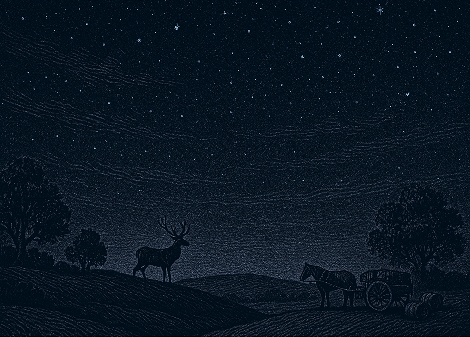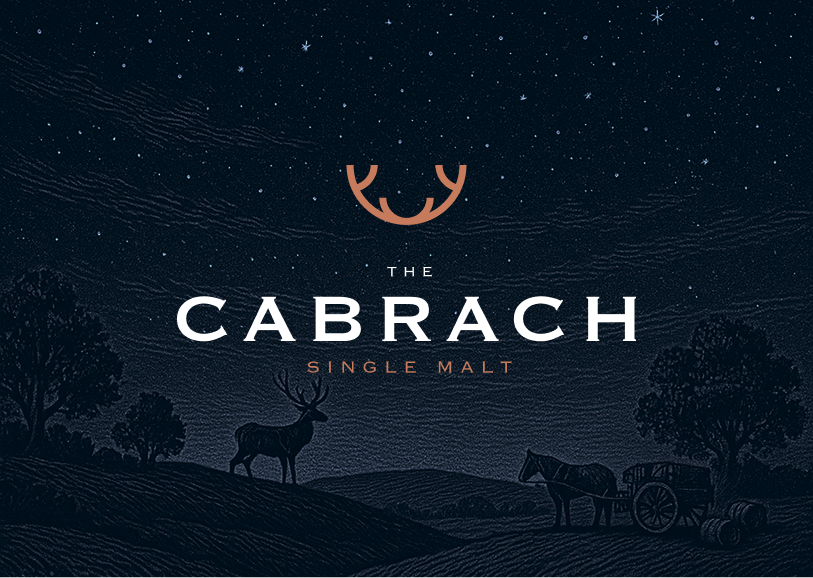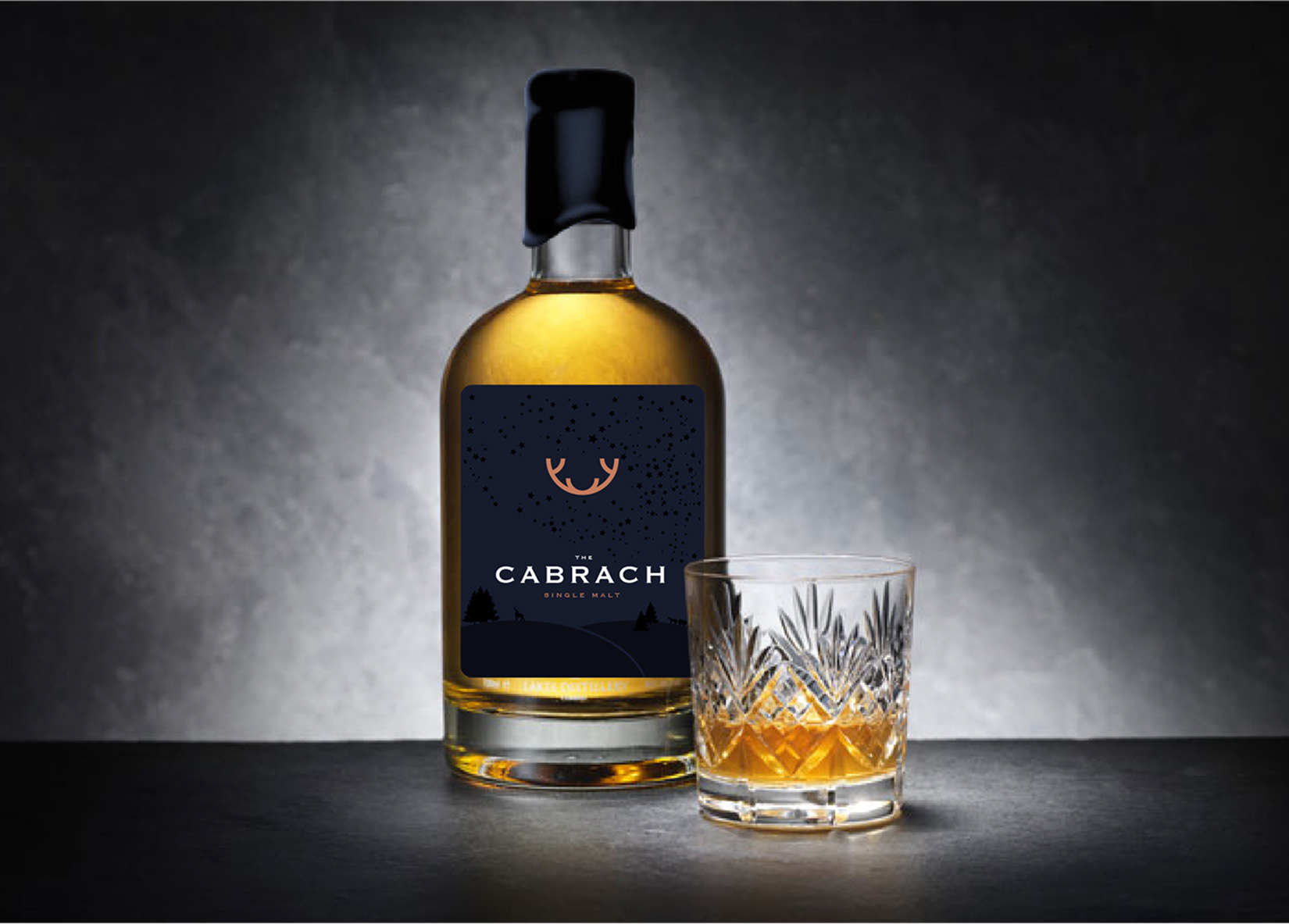
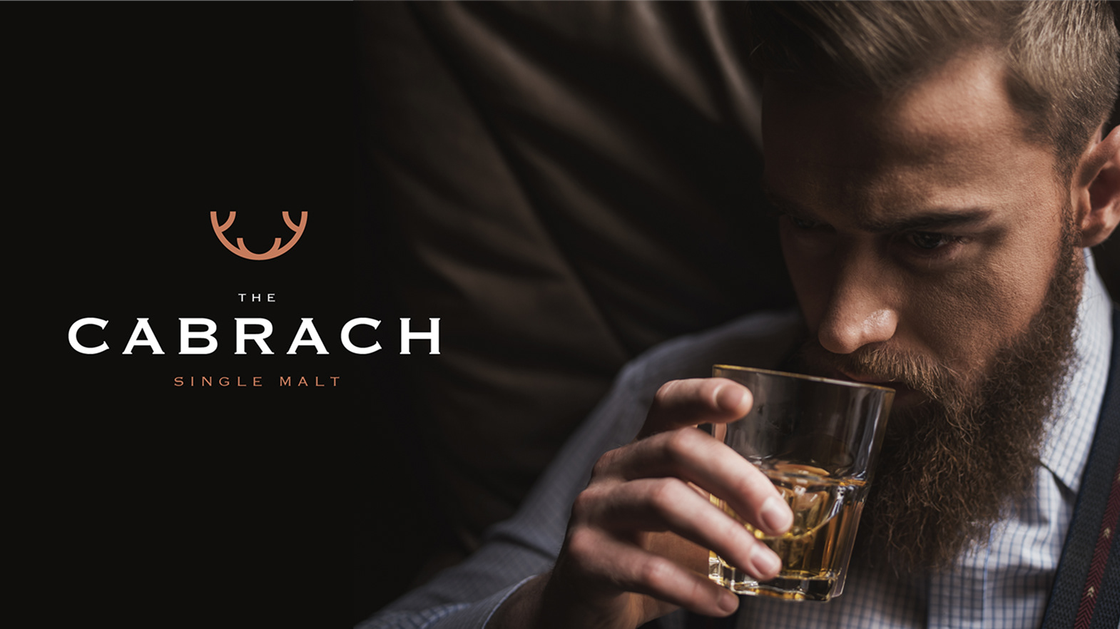
Unearthing a hidden heritage with a bold new whisky brand
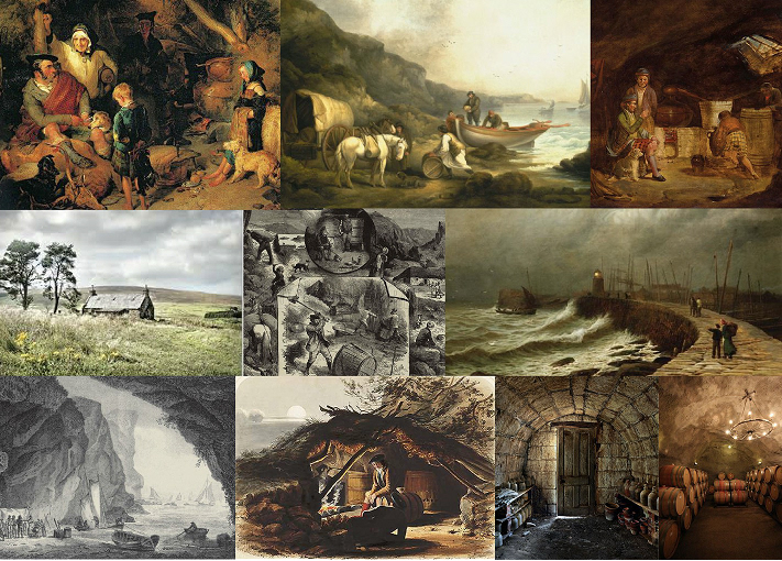
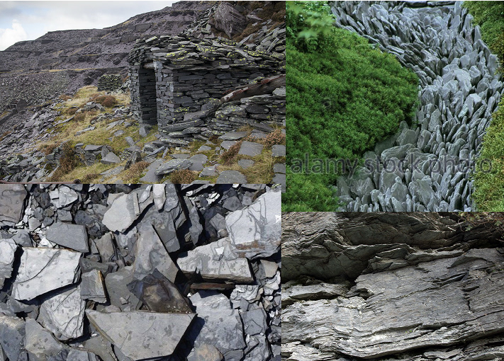
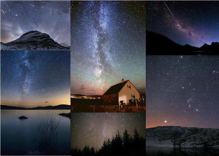
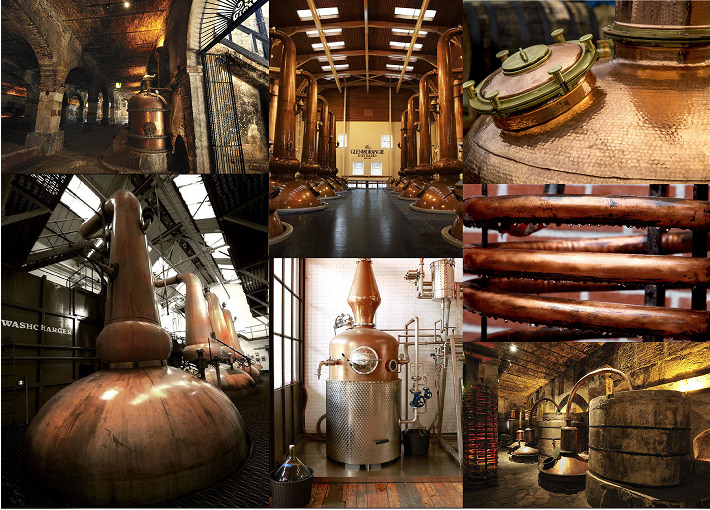
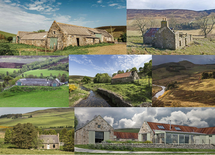
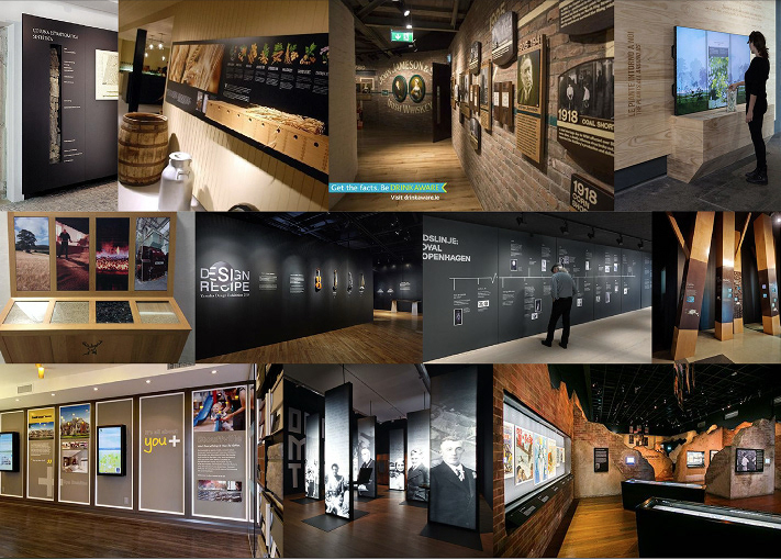
Reviving the spirit of illicit stills and remote highland landscapes, we crafted a premium brand identity for The Cabrach — blending rich storytelling with high-end detail to honour its past and stand tall in today’s whisky market.